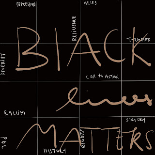
Grid and Pattern
-
Hi all! Today, I decided to relate the art I made in the app called “procreate” to Lupton’s discussion of grid and pattern. These arts were inspired by an event that happened last summer which was the Black Lives Matter protesting. Disclaimer, this is only my opinion and I am not here to persuade you to believe in the things I believe in. I just thought these arts are perfect for this topic.
-
“Grid Function similarly in the design of printed matter. Guidelines help the designers align elements in relation to each other” (Lupton 187).
When I made this, I wanted to emphasize that the Black Lives Matter hence the big lettering. However, just writing “Black Lives Matter” did not satisfy me. I wanted something that would support the statement and to answer some people who asked me “Why do they matter” whenever I say this particular statement. That’s when I came up with the idea to add those “subtitles” as I call it, in the background. When reading those “subtitles” it always ends up in the middle which in away those subtitles serves as evidence or points to support the statement in the middle and to answer why they matter. The grid helps me connect the whole piece together and come up with something I believe in. Each grid has a relation to other grid and all the grid that has “subtitles” extremely relates to the statement of Black Lives Matters. As Lupton stated, “edge become as important as the center” (Lupton 187). To me, those “Subtitles” are equally important as the statement in the middle because people experienced those things in this case, black Americans experienced those things and therefore should not be forgotten to answer people’s questions on “Why Black Americans matters”.
“The designer creates the rule but, the end result may be unexpected” (Lupton 212).
When I was in the processing of making this, I did not have ideas on what the ending result is going to look like I just wanted something respective. I was not planning to make a masterpiece I wanted to draw to express my frustration with people who can’t accept others because of their differences. I always thought differences is what makes us individually unique. I strongly believe that people should be happy that we are different from one another. However, that’s not the case, I see people hating and judging other people who are different from them and that’s just sad. I am not going to lie, the result of this art was unexpected to me but I am glad I was frustrated that day as though this is a simple art, it’s now one of my favorites as it contains such a powerful message, at least for me anyway.


loved this. thank you.
ReplyDeleteThese are really beautiful! I love how in the first one you allowed the letters that spell "Black Lives Matter" to overlap into different grips but then each subtitle is designated its own space.
ReplyDeleteI think the choice of the brown in the BLM picture really stands out.
ReplyDelete